I was thinking about the semantics and my first thought was it should be a table. If you think of the usual month layout, it is a matrix of day columns and week rows.
But you could interpret a month as an ordered list of days. The list would probably be easiest to style.
When viewed in a grid/table form, some months span 6 weeks/rows. For example this month starts with the 1st and 2nd at the weekend. Ten there are 4 full weeks from the 3rd to the 30th. Then the 31st drops onto a 6th week.
I think the real question is Table or OL, as these are HTML elements which define semantics. There is an argument for either one.
Then how you style them is a separate question. Eg, you could have a table element styled with flex. I’m not saying definitely do that, just it is a possibility.
Thanks for your time to help in the post, but I have no understanding of GRID. I have started learning it from today, in a couple of days when I will have some knack I will coke back to your post.
I think the semantics of a calendar lean heavily towards a table but I can also see cases for ol, dl or other methods. I don’t think there’s a clear answer but any one of the above should be good enough. There’s even the time element that might be considered more appropriate but I’m not really sold on that.
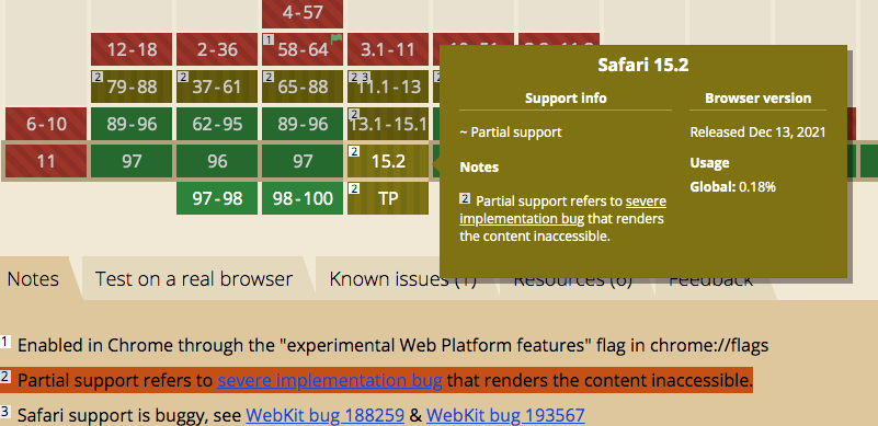
Whatever html you use Grid makes this very easy as shown in this example. Of course a table structure complicates that and you have to have nested grids or use display:contents as in the link from @sibertius above but is not supported in Safari or IOS.
It’s one of the reasons that I avoid display:contents other than for demos etc. It’s a big shame as its one of my favourite properties
I’m sure something could be worked out without using display:contents . I’m guessing all that would be needed is to remove the display:grid from the table element and apply those rules directly to the tr instead. Then set the thead to sticky. No need for display:contents at all.