I have almost done using fluid layout techniques to implement responsive design on my site. I have a row of images typically a grid of thumbnails with float: left; on img container and max-width: 100%; height: auto; properties set to img for fluid images so that when the viewport goes to tablet or minimum I declare float: none; to the floated divs in media queries relevant to their viewports to be displayed block, but in the middle of other media queries or viewports the series of thumbnails get break and fall as image attached.
All I want is that on every kind of viewport thumbnails have to resize proportionally as with their aspect ratio and adds or minus when require to fill the current view port.
I am also sharing the HTML and CSS code as reference.
HTML
<div class="thumbnails cf">
            <div class="thumbnail">
                <a href="local-shifting.html" class="hasHover">
                    <div class="mask"><span class="icon-ipm-plus"></span><h3>Local Shifting</h3></div>
                    <img class="grid-img" src="images/ipm-localshift-sml.jpg" alt="IPM Local Shifting">
                </a>
            </div>
            <div class="thumbnail">
                <a href="international-packing.html" class="hasHover">
                    <div class="mask"><span class="icon-ipm-plus"></span><h3>International Packing</h3></div>
                    <img class="grid-img" src="images/ipm-intpack-sml.jpg" alt="IPM International Packing">
                </a>
            </div>
            <div class="thumbnail">
                <a href="packing-and-crating.html" class="hasHover">
                    <div class="mask"><span class="icon-ipm-plus"></span><h3>Packing and Crafting</h3></div>
                    <img class="grid-img" src="images/ipm-packcrat-sml.jpg" alt="IPM Packing and Crafting">
                </a>
            </div>
        </div>
CSS
.cf {
/* clearfix */
}

.grid-img {
max-width: 100%;
height: auto;
}

.thumbnails {
margin:1.875em 0;
width:100%;
}

.thumbnails .thumbnail {
float:left;
margin-right: .5625em;
}

.thumbnail img {
width: 363px;
}

.thumbnails .thumbnail:last-child {
margin-right:0;
}
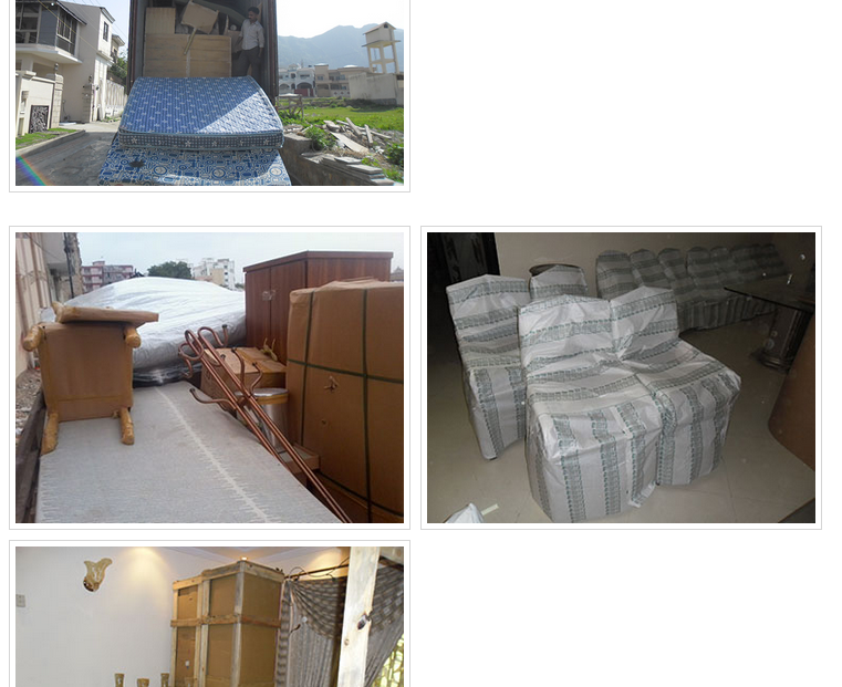
![enter image description here][1]
[1]: http://i.stack.imgur.com/fnB6V.png