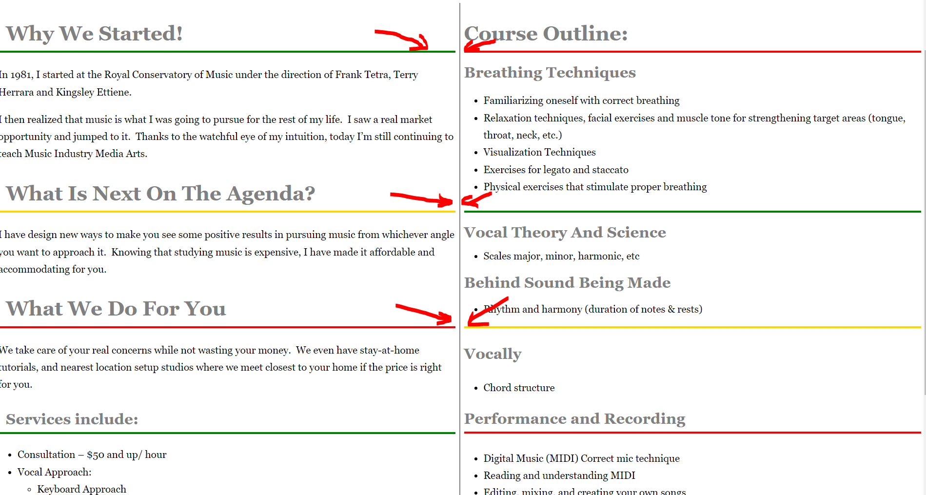
I used flexbox to handle content of this page https://test.prygara.com/services/. I needed red, yellow and green borders be on the same level to keep the borders consistent (see picture)
Is it better to keep this page as is or use grid? I was not sure about grid because the amount of content in each section is different…and I would like to keep the borders on the same level as shown with red arrows on the above pic.
P.S. The above screenshot is taken in Chrome. I just discoverd that the borders are not on the same level in Firefox. I guess that’s because I used pixels in some cases for margins…
You must have made it fit at the exact width you had your page open
You can line those up with flex or grid but for flex you’d need to do each small block individual horizontally in pairs and then they will align on each row.
With grid you would need all individual items as direct children of the parent and then you could place each block as required into the grid structure.
For both of the above you would need a div around each heading and associated text in order to place them.
As your heading text will wrap at small widths and become taller then it’s probably a job for grid as you need a row and column alignment (like a table). (Indeed display:table could do this but is not so flexible).
Assuming you don’t need the html order to matter then I would just use auto rows and not have to name every item with nth:child as that is no good for a dynamic number of elements.
e.g.
That’s much simpler and easier to manage. The difference is that the elements are place horizontally in pairs rather than the column approach you took.
No, I would prefer to keep the order of items unchanged if possible. Left column - introductions and services offered and right column - course outline. I think it would make more sense for the reader at least on desktop views. In mobile view I would stack course outline column below introductions and services offered.
P.S. I really like your solution though…trims down my spaghetti code significantly
That complicates things a little and ties your css to your mark up order which is something I don’t like to do. You could output the items from your backend as 1, 3 and 5 and then they will align to the left by default.
Otherwise you have to be specific and address each element in the css. I wouldchange the order using the order property but that isn’t a lot different from named grid areas.
Yes that message is nonsense as it’s the parent’s display that allows the direct child to be ordered. The display value (other than none) is ignored for flex or grid items.
I gave you an example of how to use the order property. If you only set one item to one then it will be ordered last as the non ordered items will come first.
Screen readers usually just read the html and not the css display. If the order of the html is important then keep it that way. I didn’t see any real significance to the order but if it’s important then keep the html structure.
Logical well structured html is always best for accessibility.
I want to add vertical line dividing left column from right column (see my first post screenshot). In my original solution I had those as two groups of flex items (4 and 4) wrapped in two divs. If I add a wrapper div to first four items and add border-right then display: grid would have no effect as they no longer direct children. What’s your thoughts on that?
The element is 2px wide so 50% puts its left edge at 50% which means it’s not centred.
Imagine the element was 50% wide then it would cover the whole right half of the page. You need to move the element back towards the left side by half its width to be centred properly.

 It probably wasn’t a good idea