When it comes to beautiful web design, one of the most overlooked elements of a web site is the site’s archive listings. As a result, I really appreciate a well-designed archive listing when I come across one, and have gathered together some of the best examples I’ve seen for this article.
Let’s take a tour through this collection of sites in which the archive listings are original, beautifully designed and, in some cases, bursting with attention to detail. Along the way, we’ll discuss what magic has been employed to make an archive’s look work so well.
A couple of really standout sites appear more than once here, due to the multiple ways in which archive listings are presented on the same site.
Sidebars
One of the most common places for a site to display its archive listings is in the sidebar. These listings are typically broken up into a listing by category and by date, and sometimes may include a listing by recency, a calendar view, or a tag cloud.
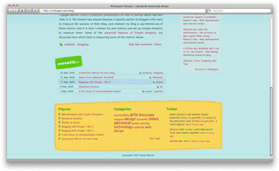
Let’s take a look at Szabolcs Bakos’s site, New Concept.

In this example, the archive listing is displayed in the second column – one of two sidebars on the right side of the page.

This archive listing starts with Categories, then has two links to a complete archive and a category archive, followed by Recent Comments. It has a very blocky treatment, but it works nicely with the site design.
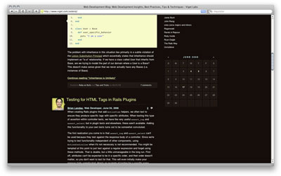
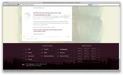
Here’s Viget Labs Inspire
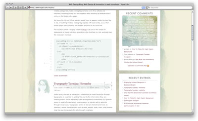
The archive treatment in this sidebar, showing the recent comments and recent entries, are minimal yet elegant. The spacing and typography work well and make this example very attractive.
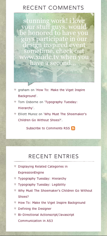
The header treatments in this sidebar are nice. But what really catches my eye is the most recent comment, which is beautifully styled in a phylactery with a watercolor background. The type is low-contrast, so could be considered hard to read; however, in this context, as it’s not the predominant element on the page, it’s a great effect (and includes a link to the comment where it can be read in higher contrast).
Next, The Statement.

The Statement uses a bold sidebar for its archive listing, which feels dimensional, even though it’s just a solid stripe with rules.
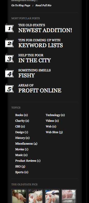
The most popular posts are very dominant, and use a fun numbered style to indicate the order of popularity.
Calendars
The next sidebar treatment we’ll look at uses a calendar, a feature that was seen frequently on earlier blogs, and not as much on newer blogs. Here’s the Viget Extend web page.
And here’s a close-up of the calendar.
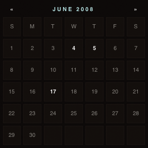
The blocky date style in the calendar above is a nice touch. The days with posts stand out more, and you can view the previous and next month using the pagination appearing to the left and right of the month and year listed on top of the calendar.
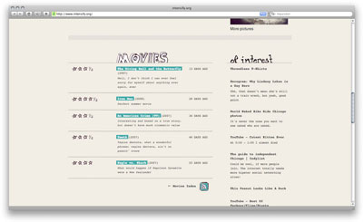
Take a look at Intensify.org by Rachel
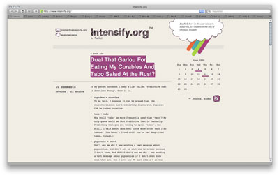
This site also uses a calendar in the sidebar, and not much else, other than a link to an index and the RSS feed linked icon.
The calendar is more open than blocky, which works well with this layout’s whitespace. The linked days use a bold yet fun pink underline.
Tag Cloud
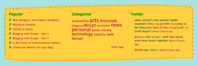
For something a little different, here’s coda.coza.
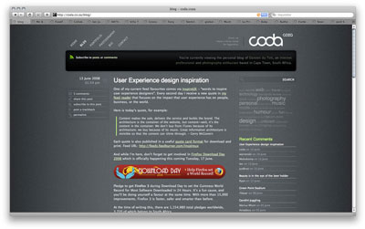
The sidebar treatment on this site uses a tag cloud to show the popularity of keywords that the post has been tagged with. It also lists recent comments and most popular posts, in a simple but nicely styled set of lists.
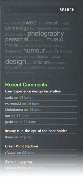
The tags are in low contrast against the background, and use different sizes to indicate popularity.
Other Treatments
This is Jeff Croft‘s homepage.
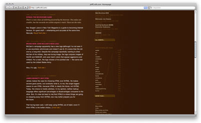
Jeff’s site is very clean and minimal, yet uses some really nice details, ranging from rounded corners and drop shadows to incredible-looking bar graphs.
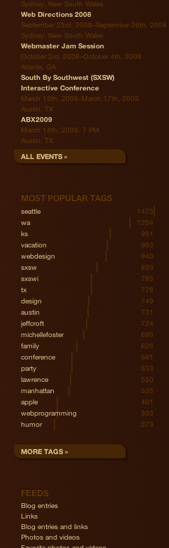
The archive styling in this sidebar focuses on clean typography. However, the most eye-catching element would be his fun, unique way of displaying popular tags; rather than using the tag cloud, he uses a horizontal bar-graph CSS-styled info-graphic. I could actually steal this …
Interactive
Next, we have the web page of Alex Buga.
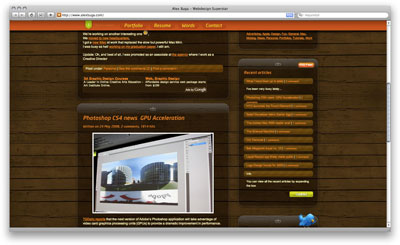
The archive treatment in this sidebar, showing the recent comments and recent entries, are minimal yet elegant. The spacing and typography work well to make this example very attractive.
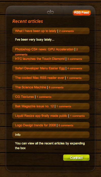
The recent articles module in the sidebar are very glossy, and have expand and contract features to show or hide the content. While the unfortunate wrapping issue is unsightly, everything else looks really tight.
Here’s another approach: Darren Hoyt Dot Com
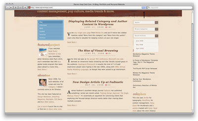
The archive listing in the sidebar on this site avoids being over-designed, and is very compact.
The list style is nice, and I like the colors. A criticism is that the list looks very detached from the interactive header it belongs to, and there are a few spacing issues.
Then there’s Komodo Media.
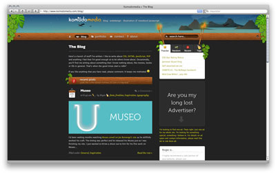
This sidebar uses a tab-switcher style archive listing, which shows different archive listing views, and helps keep the sidebar uncluttered from all the views.
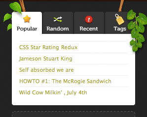
Tab-switching content can sometimes hinder usability, but the icons in the tabs help draw attention to it.
Footers
Rather than using a sidebar, a common trend in web site design is to place supplementary information (such as navigation, archive listings, photo thumbnails, and so on) in the footer. If used instead of a sidebar, the footer allows for more room in the content area for that page’s primary content; it also creates a nice anchor for the bottom of the page. We’ll look at footers that are more defined as the “floor” of the web site; we’ll also look at some “pseudo-footers,” in which the content falls at the bottom of the content post area.
Some of these examples are of sites we’ve already looked at for sidebars. Those sites get double points!
Let’s talk lists in footers: first, Viget Labs Inspire.
The footer treatment for this site is a large, dark area mostly used for archives. The category listing follows the same width as the content area, while the monthly archive follow the same width as the sidebar area.
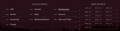
The typography used in these archive listings are gorgeous, and accented by nice rules and simple, yet elegant graphic treatments.
Next, Designing the News.
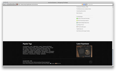
Designing the News also uses a dark space at the bottom of the page to display supplementary information.

The archive treatment here is super simple: just a list of popular tags and the latest experiment.
Nimbupani Designs has an interesting and effective solution.
The archive listing in this footer section cannot be missed; bright yellow is hard to overlook!
The stitching appearance around the border is playful and really makes this footer work. The archive listing simply uses a Popular posts listing and a tag cloud for Categories.
Other Approaches
Let’s look at Komodo Media again.

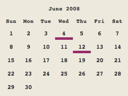
Komodo makes use of a really great-looking calendar at the bottom of the content area; this is what I’m calling a “pseudo-footer”, because it’s more like the bottom of the post area, rather than the bottom of the web site.
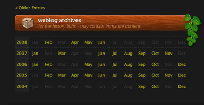
The calendar uses horizontal rows, each representing one year’s worth of posts; months that contain posts are brighter and linked. The wood-grain header and leave detail are a very nice touch.
Another site we’ve looked at before, Intensify.org by Rachel uses the bottom sections of the page to summarize reviews of movies, books, and music.
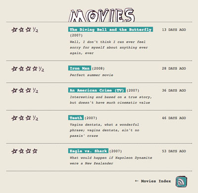
In this Movies footer section, the typewritten and hand-drawn look is fun and playful.
Interactive
For something different: Fling Media.
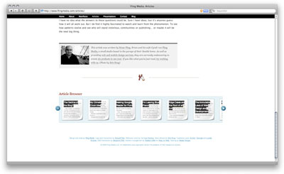
Fling Media uses a “swisher” or a “slider” (whatever you might call it), at the bottom of the page.

Each article posting represented here are designed to look like little pages: very cute!
Archive Pages
Some web sites have an entire page or pages devoted to archives. Unfortunately, the majority of the examples I have seen use a very bland list of posts. They seem to be the forgotten pages, or an afterthought. So it’s really nice to come across a striking archive page – often, it can make or break the design of the web site.
The examples we’ll look at now show a few different ways designers have chosen to display their archive pages. Once again, a few of these examples are of web sites we’ve already looked at. (Triple points!)
Jason Santa Maria‘s archive page, entitled Articles, is a super-clean, minimal design, and it’s very well done.
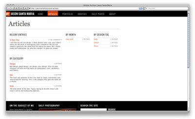
Recent entries, a category listing, monthly archive, and “design tags” make up the components. The “design tag” is a fun concept, where Jason plans to add additional styling and imagery for the web site design, depending on post; these designs are tagged with attributes of the design, which can then be indexed here.
Boagworld uses a simple styled list for the archive page.
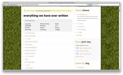
There is also a latest shows listing for the podcasts, which uses another simple styled list, but shows more detail for the most recent show. Finally, a tag filtering mechanism makes finding relevant posts much easier.
Orderedlist uses a clean article listing, with nice subtle rules to add a bit of dimensionality.
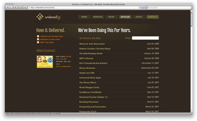
There is also a filter search field that uses “live-search” -like effects, which could be compared to Mac OS X’s Spotlight search.
Designing the News uses a simple archive page with archives by month and by category.
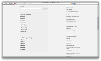
While I do feel that this page could have been pushed a little bit further, I like the combination of Archives with Search.
Here’s Jeff Croft‘s site again.
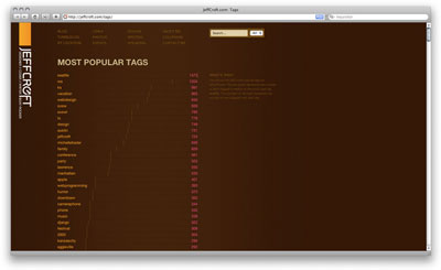
The bar graph style that Jeff used in his sidebar implementation is used again on his tag archive page – a refreshing way to visualize popularity.
And another appearance from The Statement!

The Statement uses the previously mentioned sidebar treatment again on its archive page, but also dedicates a sleek, attractive archive page.
Honestly, I don’t think I need to say much about AvalonStar …
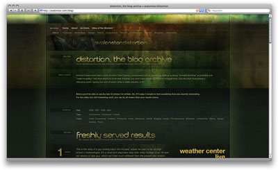
… except that it’s gorgeous.
Conclusion
I hope you enjoyed this little tour! As you can see, archive listings come in many forms and styles, and can deploy many different types of features. Whatever location and functionality it is that you decide to use when designing an archive listing, give it some extra love and care. Do something unexpected and beautiful. It will be like that really well-organized, color-coordinated closet you have in your home. Unless you’re like me …
Frequently Asked Questions (FAQs) about Beautiful Website Archives
What are the key elements of a beautiful website archive?
A beautiful website archive should be easy to navigate, visually appealing, and organized. It should have a clear and intuitive layout that allows users to easily find the information they are looking for. The use of categories, tags, or a search function can greatly enhance the user experience. Additionally, the visual design should be consistent with the rest of the website, using similar colors, fonts, and styles. Lastly, the archive should be regularly updated to ensure that all information is current and relevant.
How can I make my website archive more user-friendly?
To make your website archive more user-friendly, consider implementing a search function, categorizing your content, and using clear and descriptive labels. A search function allows users to quickly find specific content, while categories help to organize your content in a logical and intuitive way. Clear and descriptive labels can help users understand what each piece of content is about at a glance.
What are some examples of beautifully designed website archives?
Some examples of beautifully designed website archives include the New York Times’ archive, which features a clean and minimalist design, and the BBC’s archive, which uses a grid layout and large images to showcase its content. Other examples include the National Geographic’s archive, which uses a timeline layout to display its content, and the Smithsonian’s archive, which features a mix of text and images to create a visually engaging experience.
How can I incorporate visual elements into my website archive?
Visual elements can greatly enhance the appeal of your website archive. You can incorporate images, videos, infographics, or other visual content into your archive. These elements can help to break up large blocks of text, making your archive more engaging and easier to navigate. Additionally, visual elements can help to convey information in a more digestible and engaging way.
How can I ensure that my website archive is accessible to all users?
To ensure that your website archive is accessible to all users, you should follow web accessibility guidelines. This includes using alt text for images, ensuring that your website is navigable with a keyboard, and using clear and readable fonts. Additionally, you should ensure that your website is responsive, meaning that it can be easily viewed and navigated on a variety of devices, including desktop computers, laptops, tablets, and smartphones.
How often should I update my website archive?
The frequency of updates to your website archive will depend on the nature of your website and the content you produce. However, as a general rule, you should aim to update your archive regularly to ensure that all information is current and relevant. This could be on a weekly, monthly, or quarterly basis, depending on your needs.
What are some common mistakes to avoid when designing a website archive?
Some common mistakes to avoid when designing a website archive include making it difficult to navigate, not updating it regularly, and not making it accessible to all users. A poorly designed or outdated archive can frustrate users and make it difficult for them to find the information they are looking for. Additionally, failing to make your archive accessible can exclude certain users, such as those with disabilities.
How can I optimize my website archive for search engines?
To optimize your website archive for search engines, you should use SEO best practices. This includes using relevant keywords in your content, using descriptive meta tags, and ensuring that your website is fast and responsive. Additionally, you should ensure that your archive is easily navigable, as this can also impact your search engine ranking.
Can I use a website archive to showcase my portfolio?
Yes, a website archive can be an effective way to showcase your portfolio. You can use it to display your past work, categorizing it by type, date, or client. This can provide potential clients with a comprehensive overview of your skills and experience.
What are some tools or platforms I can use to create a website archive?
There are many tools and platforms available that can help you create a website archive. These include content management systems like WordPress, which offer built-in archiving features, as well as specialized archiving tools like Archive-It. Additionally, many web hosting services offer built-in tools for creating and managing archives.
 Jina Bolton
Jina Bolton is an interaction designer at Crush + Lovely. Previously, Jina worked at Apple, Inc. as a visual interaction designer and front-end web developer. Jina Bolton is a visual interaction designer in Silicon Valley living in San Francisco. She is a co-author of The Art & Science Of CSS and holds a BFA in Computer Arts and Graphic Design from Memphis College of Art.