flexible adjective
1. capable of bending or being bent, able to be easily modified to respond to altered circumstances or conditions.
box noun
1. a rigid typically rectangular container.
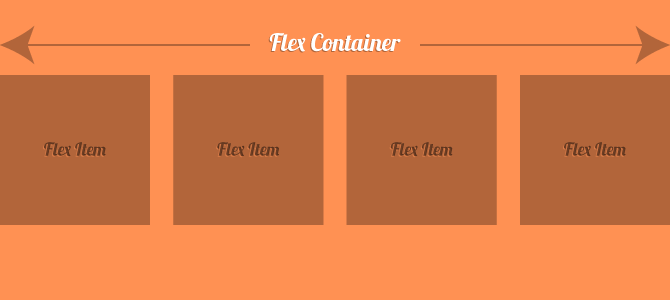
The Flexible Box Module, a.k.a. flexbox, is all the latest and greatest at the moment. It digs into the fundamentals of the CSS box-model, providing us with a powerful and highly useful module for layout configurations. It is easily defined in our CSS and markup, and responsive adaptations are just a media query away. Think about a world where we don’t have to clear floats or utilise frameworks or masses of code to create responsive grids. Flexbox does all the dirty work. For us, it’s just a simple implementation. We define a flex container, and in it we have flex items.
Exactly What is Flexbox?
Here’s a definition of flexbox, according to MDN:
The CSS3 Flexible Box, or flexbox, is a layout mode providing for the arrangement of elements on a page such that the elements behave predictably when the page layout must accommodate different screen sizes and different display devices.
In simple words, we can mark up a few flex items inside a flex container, and define the layout arrangement with our CSS. We have numerous options when defining our layout arrangement that make possibilities endless. Here are a few:
flex-direction– With this property we can specify if we want the items to be in a row or column, and also if we want the items to be in order of markup appearance or reversed.justify-content– Let’s us declare how the browser should distribute the available space between elements. In other words, if we have 3 elements at a combined total width of 50% of their container, we can specify whether to pack the elements to the left, right, center, distribute from left to right with an even amount of spacing in between them, along with some other options.flex-wrap– With this property, we can specify whether we want our flex items to jump to a new line if the flex container runs out of space.
The points above are just a small sampling of the capabilities of flexbox, and you can get much further insight and documentation by visiting the flexbox guide on MDN. I encourage you to go experiment and get familiar, but I won’t bombard you with any more theory. Let’s look at how flexbox has evolved over the years.
A History of Flexbox
Flexbox is now becoming more widely used due to its increasing support as the days roll by, but it has actually been around since 2009. With that in mind, there’s a lot of documentation and examples around the web these days that utilise old versions (although this is starting to fade out).
In a nutshell:
- The 2009 spec was released, and with it came all the
box-type declarations. If you see any tutorials or example CSS that usebox-*type properties, you’re looking at the initial, now outdated version of flexbox. Here’s the property index from the 2009 spec. - In 2011, the spec awkwardly changed for a bit. A flex container was defined using
display: flexbox, ordisplay: inline-flexbox(which you can see here). There was also a flex() function. - In 2012, the spec was updated to what we know today. If you see the property
display: flexon a flex container, then you’re with the times.
It looks like the current version is here to stay, and it is very comprehensive. Here’s the current spec from the W3C that contains every detail.
Flexbox in Action
That’s enough talk about flexbox, let’s now take a look at a basic example. Here’s our markup:
<div class="container">
  <div class="item">
    <h2>Item 1</h2>
  </div>
  <div class="item">
    <h2>Item 2</h2>
  </div>
  <div class="item">
    <h2>Item 3</h2>
  </div>
  <div class="item">
    <h2>Item 4</h2>
  </div>
</div>
And here’s the CSS to put flexbox in action:
.container {
  display: flex;
  justify-content: space-between;
  align-items: center;
  flex-wrap: wrap;
}

.item {
  padding: 20px;
  width: 22%;
  background-color: rgb(255,150,100);
}
This makes the .container element our flex container, and the .item elements our flex items. Here’s a CodePen demo:
See the Pen imJGz by SitePoint (@SitePoint) on CodePen.
This all seems well and simple enough, but don’t get too excited. We have quite a few things we need to consider before using this CSS feature.
Browser Support and Polyfills
It’s pleasing to know that browser support is high and increasing, and we can see the breakdown by having a look at flexbox on Can I use…. It’s supported in IE10 and higher, and across all other browsers except Opera Mini. This is pretty awesome to see. If you’re looking out for IE9 and below though, you’ll need to go down the polyfill/fallback route.
Unfortunately, the only polyfill available is Flexie, which enables the 2009 flexbox model on unsupported browsers. There are no polyfills for the new syntax (although Richard Herrera, who created the original flexbox polyfill is working on one for the updated syntax). In any case, you’ll find yourself wanting to stay clear of polyfills to begin with, as they tend to be slow.
Fallbacks should be generally easy to implement. Modernizr, a feature detection tool, allows us to detect if a browser supports flexbox (legacy and current), so targeting should be easy, and should look something like this:
.container {
  display: block;
}

.flexbox .container {
  display: flex;
}
If Modernizr isn’t your thing, and you’re not heading down the Opera road, then conditional CSS may be all you’ll need to help you sort things out for IE9 and down.
Vendor Prefixes
The syntax for flexbox as shown above looks concise and pretty, but that’s because I haven’t even begun to talk about vendor prefixing. Flexbox is a near nightmare with vendor prefixing, and that’s mainly due to the fact that the spec has changed 3 times in 3 years. Older WebKit browsers are still using webkit-prefixed properties, and some of them are still using the 2009 implementation.
If you need to support all these older implementations, you’ll need a host of *-box, *-flexbox, and *-flex prefixes. The compiled CSS for our .container would look like this:
.container {
  display: -webkit-box;
  display: -webkit-flex;
  display: -ms-flexbox;
  display: flex;
  -webkit-box-pack: justify;
  -webkit-justify-content: space-between;
  -ms-flex-pack: justify;
  justify-content: space-between;
  -webkit-box-align: center;
  -webkit-align-items: center;
  -ms-flex-align: center;
  align-items: center;
  -webkit-flex-wrap: wrap;
  -ms-flex-wrap: wrap;
  flex-wrap: wrap;
}
That’s not pretty! But there are solutions at our disposal.
Autoprefixer
Autoprefixer is a great and up-to-date tool that will automatically prefix your CSS for you. You can set it up as a Grunt task, and have it watch your stylesheet for changes. It’s a beautiful tool, and will save you tons of headaches.
Sass and Compass
Sass can also come to the rescue here, as long as we set up some mixins to get us going. Here’s a set of Sass mixins and a basic implementation, taken from CSS-Tricks’ guide to flexbox:
@mixin flexbox() {
  display: -webkit-box;
  display: -moz-box;
  display: -ms-flexbox;
  display: -webkit-flex;
  display: flex;
}

@mixin flex($values) {
  -webkit-box-flex: $values;
  -moz-box-flex:  $values;
  -webkit-flex:  $values;
  -ms-flex:  $values;
  flex:  $values;
}

@mixin order($val) {
  -webkit-box-ordinal-group: $val;
  -moz-box-ordinal-group: $val;
  -ms-flex-order: $val;
  -webkit-order: $val;
  order: $val;
}

.container {
  @include flexbox();
}

.item {
  @include flex(1 200px);
  @include order(2);
}
Compass is a CSS authoring framework that offers a ton of mixins for authoring our Sass files. They do have a mixin for flexbox, but unfortunately it’s for the old syntax. However, Autoprefixer (mentioned above) integrates nicely with Compass, and handles all the prefixing for you without having to change your workflow. Neat.
Finally, if you’re using PHP as your CSS preprocessor, you might want to have a look at Flexbox Functions that provides some easy-to-use methods for dealing with the various parts of flexbox.
So… Are We Ready to Use Flexbox?
We looked at what flexbox is, where it came from, how to use it, support, fallbacks, prefixing, and the works. But still, we have to ask ourselves if we’re ready to start implementing it in our projects. For me, the answer is a resounding Yes. But that resounding yes has some underlying emphasis:
- Know your project, your desired outcome, and your target market. If you’re publishing HTML5 mobile apps, then go for it. If you’re developing an accounting system for a business using Windows 98, you’ll probably need to stay away!
- Understand that polyfilling the old version might help you out, but will slow down the already-slow browsers. In general, I recommend staying away from polyfills — there’s no point further slowing down an already old system.
So go on out there and learn, practice, and implement flexbox in your next suitable project. It’s a fantastic and powerful feature, and is a lot of fun to use.
Frequently Asked Questions about Flexbox
What is the main advantage of using Flexbox in CSS layout?
The main advantage of using Flexbox in CSS layout is its flexibility. It allows for efficient arrangement of elements in a container, even when their sizes are unknown or dynamic. This makes it a powerful tool for building complex layouts and applications. Flexbox’s layout algorithm is designed to accommodate different screen sizes and display devices, making it ideal for responsive design.
How does Flexbox differ from traditional CSS layout methods?
Traditional CSS layout methods, such as floats and positioning, require more effort and complex calculations to create a flexible layout. Flexbox, on the other hand, simplifies this process by automatically calculating the size and position of the elements based on the available space in the container. This makes it easier to create a flexible and responsive layout.
Can I use Flexbox with older browsers?
While Flexbox is supported by all modern browsers, it may not work properly with older browsers. However, there are polyfills available that can provide Flexbox-like functionality for older browsers. It’s also recommended to use vendor prefixes to ensure compatibility with different browsers.
How can I align items vertically in a container using Flexbox?
To align items vertically in a container using Flexbox, you can use the ‘align-items’ property. This property accepts several values, including ‘flex-start’, ‘flex-end’, ‘center’, ‘baseline’, and ‘stretch’. By default, the ‘align-items’ property is set to ‘stretch’, which makes the items fill the container vertically.
What is the ‘flex’ property in Flexbox?
The ‘flex’ property in Flexbox is a shorthand property for setting the ‘flex-grow’, ‘flex-shrink’, and ‘flex-basis’ properties. It allows you to control how a flex item grows and shrinks to fit the available space in the container. The ‘flex’ property can take one, two, or three values.
How can I reverse the order of items in a Flexbox container?
To reverse the order of items in a Flexbox container, you can use the ‘flex-direction’ property with the ‘row-reverse’ or ‘column-reverse’ value. This will reverse the order of the items along the main axis.
Can I nest Flexbox containers?
Yes, you can nest Flexbox containers. This means you can have a Flexbox container inside another Flexbox container. This can be useful for creating complex layouts.
How can I control the spacing between items in a Flexbox container?
To control the spacing between items in a Flexbox container, you can use the ‘justify-content’ and ‘align-items’ properties. These properties allow you to align and distribute the items along the main and cross axes.
What is the ‘flex-wrap’ property in Flexbox?
The ‘flex-wrap’ property in Flexbox controls whether the items should wrap onto multiple lines or not. By default, the ‘flex-wrap’ property is set to ‘nowrap’, which means the items will try to fit onto one line.
Can I use Flexbox to create a grid layout?
Yes, you can use Flexbox to create a grid layout. However, it’s important to note that Flexbox is a one-dimensional layout model, which means it can control either the rows or the columns, but not both at the same time. For a two-dimensional layout model, you might want to consider using CSS Grid.
 Nick Salloum
I'm a web designer & developer from Trinidad & Tobago, with a degree in Mechanical Engineering. I love the logical side of the web, and I'm an artist/painter at heart. I endorse progressive web techniques, and try to learn something every day. I try to impart my knowledge as much as possible on my personal blog, callmenick.com. I love food, I surf every weekend, and I have an amazing creative partnership with fellow mischief maker Elena. Together, we run SAYSM.