I love color! In fact, one of the ways that a website entices me to hang around awhile is with a creatively colorful design. Some websites are brimming full of various contrasting colors, others have stunning photos full of vivid colors, and still others only have a smattering of color here and there that help draw the eye.
The following websites use a variety of color design techniques to create that stunning effect, but all have one common theme: color is used cleverly in some way to really make the design uniquely appealing. So, take a look and make sure to let me know which are your favorites and why!
Hugs for Monsters
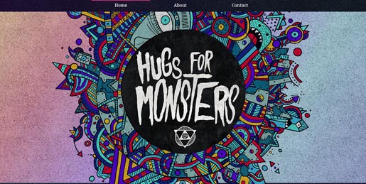
A bit on the darker side of color, this one perfectly blends the dark monster theme with some very colorful illustrations.
Camp Firebelly
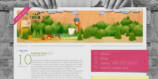
The bright illustration stands out very well from the dull, grey background.
Scary Girl
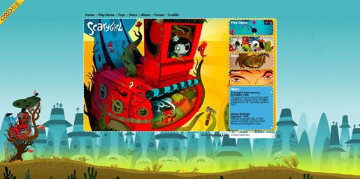
This one almost borders on too much color, but the designer somehow walks that perfect line and blends the colors very well.
Adidas Interactive
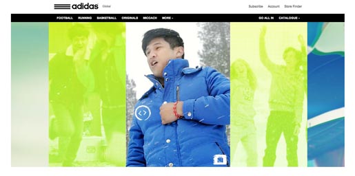
How clever to use a color overlay on the videos that aren’t currently being watched, rather than just a boring grey!
Budweiser
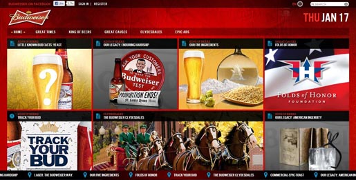
The bright red contrasts well with the browns, greys, and yellows — I can’t decide if I want to sing a Christmas carol or eat some pizza with my Bud Light!
Miss Cupcakes
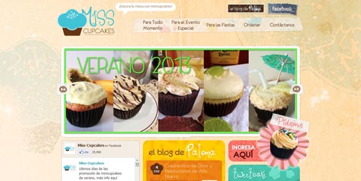
The variety of pastel colors on this site go well with the fancy cupcakes, and the neon fonts and stroke around the main image really stand out.
Jubble Bubble Tea
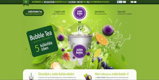
A creative, colorful illustration for a creative tea, the plain background creates a nice contrast with the busy illustration.
Coca Cola Polar Bear
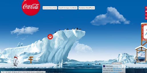
Wow! Stunning, vivid blue skies and water contrast well with the Coca Cola Red and the white polar bear.
Aspect Photography
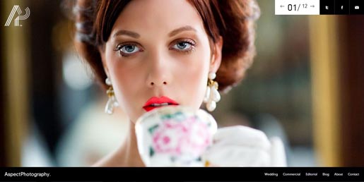
Scroll through this site and you’ll see the that featured photographs all have amazing color in them.
Red Monkeys
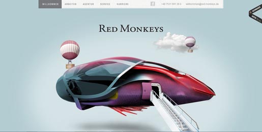
The colors in this unusual illustration help to make the imagination soar.
Di Biasotto
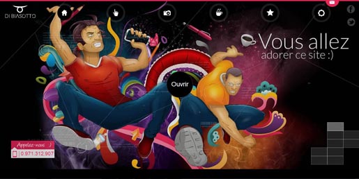
The grafitti-like illustration pops out from the black background, making the colors look almost neon.
The Yield Design Co. Picnic Bag
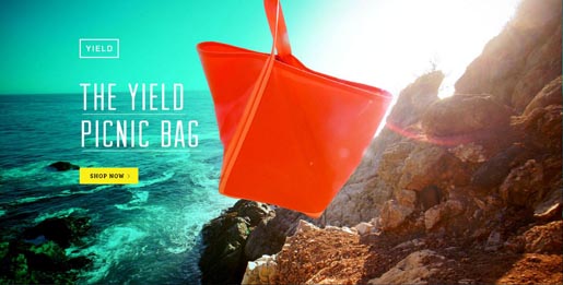
Turquoise, yellow, orange, brown — all of the colors blend together very well.
Ramayana
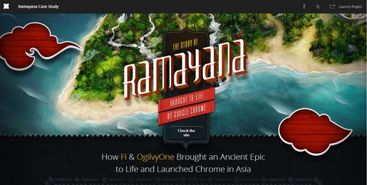
The greenery of the island stands out in stunning display, and the red graphics are a nice touch.
Andrei Gorokhov
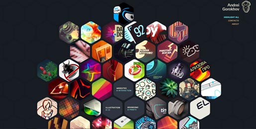
Different colored images in the shape of a honeycomb and set against a dark background really stands out.
Cheese Please Game

Vivid blue, pink, and yellow help the 3D graphics really leap off the page.
Creepy Cute
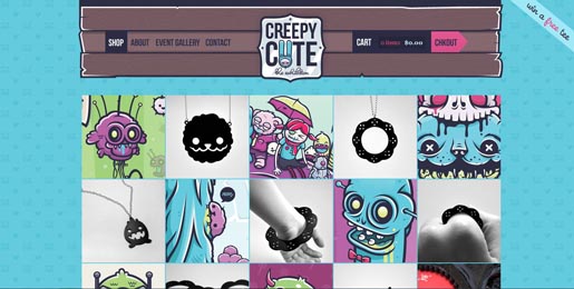
The design cleverly reflects the name of this site with creepy images colored in girly pastels.
Daniel Sitek
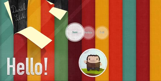
The bright colors are so eye-catching! And, I love how some of the stripes are peeling off of the background.
G’NOSH
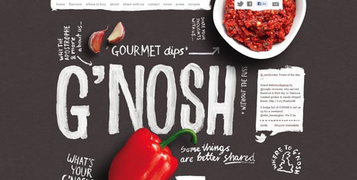
This is a great example of how just a little color can draw the eye well. The well-placed, vividly-colored food items make you want to keep scrolling down the page.
Soleil Noir Believe
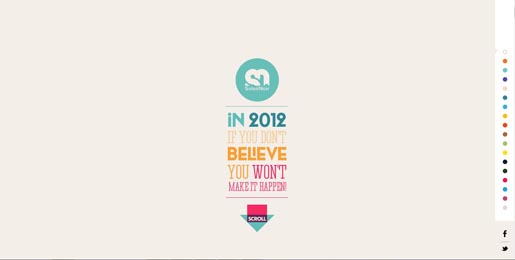
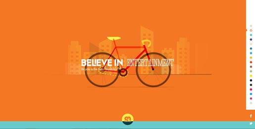
One of the most colorful and entertaining sites I came across, this one uses a different color for every “believe in…” quote.
Bongo Comics
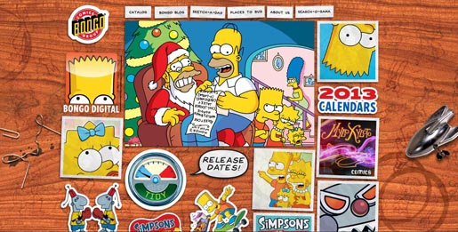
The bright, postcard and sticker-like comics stand out very well against the brown, wooden background — a nice way to avoid a cluttered look with lots of images.
Go Miniman Go!
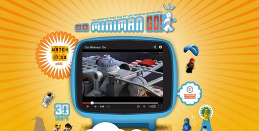
The bright sunburst focuses our attention on the screen, and the typography for the title is perfect with the outline of blue around the red and white letters.
Struck
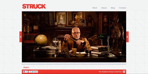
Another site that doesn’t have much color, but the red highlights draw your eye to important sections of the screen — and do you also notice a hint of red hues in each of the photos?
Marie Catrib’s
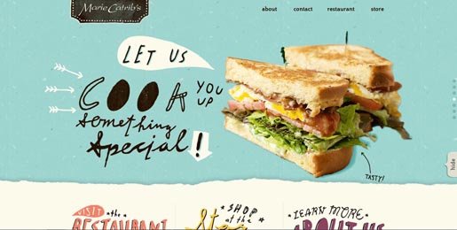
I’ve used this site in website roundups before — it’s one of my all-time favorites with the light blue background and vividly colored photos. The colored font heading below the fold are also quite appealing.
Pieoneers
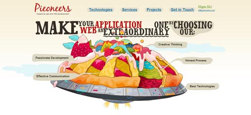
Another favorite of mine, this site not only has turned pie into a floating piece of technology, but the colors are also brilliant!
Sibling Rivalry Wine
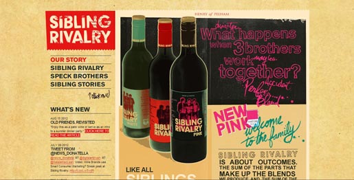
This is an interesting design that cleverly includes two clashing colors — red and pink — and somehow makes them look good together.
Puma Bio Web
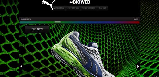
Notice the color slider? I had too much fun sliding along the different colors to watch the shoe and the website change colors.
Alexa Buga

Usually I despise this shade of green, but this designer toned it down with a gradient and different shades of brown and made it look, well, rather appealing.
Balhar.com Ahoy Jano
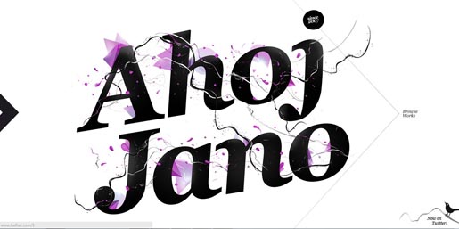
This website uses one color for the graphics, using a minimal look to speak volumes.
Haafe and Haph
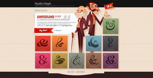
The color shades on the characters’ suits somehow blend perfectly with all of the different ampersand backgrounds. The subtle background ties it all together as well — very sophisticated and fun at the same time!
Florida Flourish
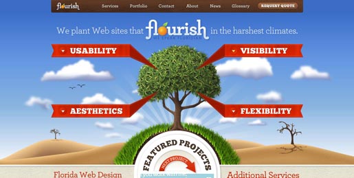
The bright colors of the graphics (as well as the red ribbons) make for a very aesthetic design (I just have to overlook the fact that they capitalized the word “websites” and separated it into two separate words).
Which is your favorite and why? Do you consider color a powerful tool that makes or breaks a design, or is it more of a finishing touch?
 Tara Hornor
Tara Hornor has a degree in English and has found her niche writing about marketing, advertising, branding, graphic design, and desktop publishing. She is a Senior Editor for Creative Content Experts, a company that specializes in guest blogging and building backlinks. In addition to her writing career, Tara also enjoys spending time with her husband and two children.