From time to time, we might find ourselves overworked. Perhaps there’s one month (or several) in the year where clients are snowballing left, right and center. You decide to cut corners and use Font Awesome instead of designing your own icon set, or researching some other kind of CSS-based icon toolkit.
And that’s how it starts. Before you know it, you’re automating your design choices without even so much as a second thought.
Let’s explore 3 ways that we can break out of that awful slump.
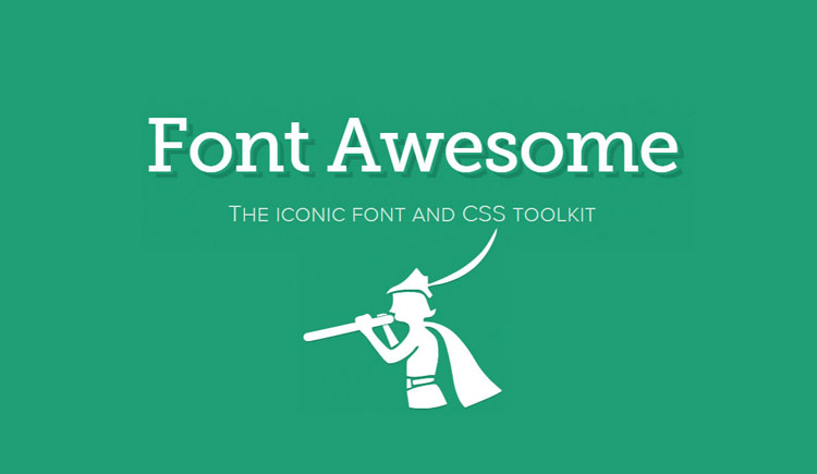
1. Ditch Font Awesome and Try Other Icon Styles
Right, let me start by saying that there is actually nothing wrong with Font Awesome – I use it quite often. Not every single element on the webpage needs to be constantly clamouring for attention. Font Awesome is subtle, and sometimes all the user needs is a subtle hint.
However, sometimes we need to use icons on a much larger scale – often side-by-side with blocks of text as a means of adding further context while explaining things to the user – and this is where we cross the line from being subtlely understated to, unfortunately, generic.
Make no mistake: this is not a case of being flashy for flashy’s sake. Icons are an ideal way of establishing a strong, memorable brand and they’re an essential factor in creating a style guide for any serious business.
As a quick rule of thumb: if your first choice of iconography is Font Awesome and you’re not researching any other icon styles, then your visual aesthetic has very likely become generic.
Design marketplaces such as Creative Market and UI8 are crawling with endless choices of fresh icon sets that are well made and very reasonably priced.
So, go and take a look!
2. Don’t Choose Flat Design Just Because Everybody Else Is
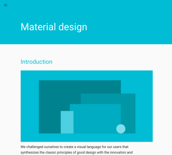
A lot can be said about flat design, both good and bad, and the same applies to Google’s Material Design as well. I’ll say the same thing that I said regarding Photoshop and Sketch – it’s not about which is the better tool – it’s about which is better suited to the task at hand. Any competent designer should be able to compare both and decide which is most suitable (if any) on a technical level.
Not only that, but both styles come with their own set of suggested fonts and colours, with Material Design being a lot more specific than the general principles of flat design.
It’s also important to remember that you don’t have to adopt the entire set of principles laid out by these styles of design, and instead I would suggest using them as a breeding ground for your own spawn of design aesthetic.
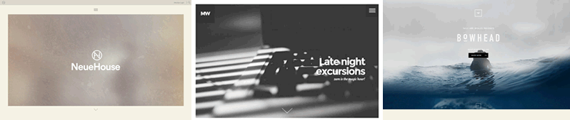
3. Fullscreen Headers Are a Big Risk
Having a huge, fullscreen header can make a bold statement – there’s no denying that – but it’s a wasted opportunity if you’re using the same old fonts, the same old “startup stocks” and the same old rounded corner (or “ghost”) buttons. It says nothing about you or your business and causes a delay in the user reading the awesome incentives of converting to your service.
Consider these three alternatives instead:
- Reduce the big header by 10/20/30% to let the user know that there’s more to be read. If you need an attention-seeking “down arrow” to suggest that there’s more content, you’re probably doing it wrong. Websites shouldn’t need to come with a user manual.
- It’s highly unlikely that you’ll convert a user within a few seconds, but they will make a decision to keep reading or turn back within that critical time. Instead, use creative typography and alternative layouts to create a smart “mini-advert”.
Provoking a reaction is what will motivate the user to dedicate their valued time to learning more about what you’re selling. Adding a conversion button is plain common sense, but making it the sole focus of your entire above-the-fold content is aimless. It’s the equivalent of asking for the credit card of someone who is simply looking in your shop window – it’s the right option at the wrong time.
- Eliminate it altogether. If you can explain your website in a single sentence (or two), and offer three smashing reasons to buy it, then include a big conversion button and call it a day, then why bother with a big header?
Simply include a thorough FAQ and an easy way for the user to contact you, otherwise you may run the risk of overselling it or boring the user completely. For bigger commitments, such as expensive items or long-term subscriptions, this wouldn’t be suitable, but if you’re selling something small or inexpensive, there’s no need to make the website longer than it needs to be.
Conclusion
It’s an ongoing struggle with trends. We often fall in love with the simplicity of a free service or become victim to the overuse of a certain design aesthetic, leading to web designs with no identity, or sometimes even outright clones.
Sometimes we look at design inspiration and think, “that’s really cool”, but fail to spend enough time studying what makes it a “good” design. Later we’ll replicate it in a future design and expect the same effectiveness – and often be disappointed.
I’ve mentioned some of these in this article today – the best way to combat a robot-made design is to think deeply on the choices you make as a designer, and try to show cause for your choices. If you can’t convincingly explain why you’re doing it in the way that you are, it’s probably not the right way. It’s lazy!
What other trends do you see being misused way too much?
 Daniel Schwarz
Previously, design blog editor at Toptal and SitePoint. Now Daniel advocates for better UX design alongside industry leaders such as Adobe, InVision, Marvel, Wix, Net Magazine, LogRocket, CSS-Tricks, and more.