I’m a beginner web designer and i have created this website prototype for first time…and i get confused that how can i fill this white space in my website prototype and please give me suggestion and please share your opinions on my design work so i can grow my work and creativity…
Welcome to the forums, @faizkhatri00. I’m not sure what you mean by this? Are you looking for how to fix your coding so that the whitespace does not appear there? If so, could you please post the html and css of the working page.
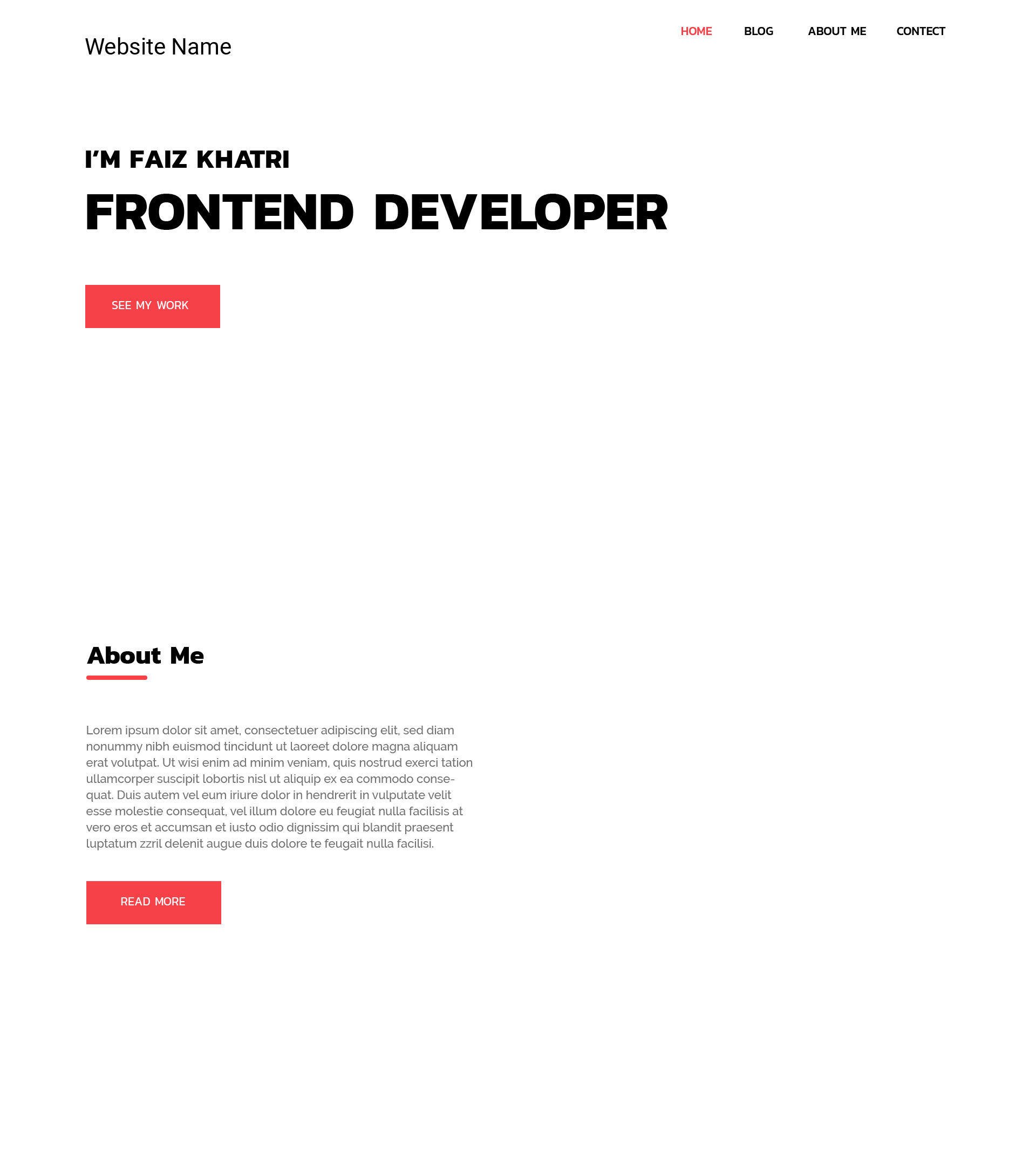
If, as I assume because of the category you have chosen, you are asking what elements can be added to your design to fill the whitespace, an image above the About Me heading would add interest to your design. But remember that whitespace to a certain extent is a good thing, so don’t fill it up with so much that your webpage becomes cluttered and confusing.
Is there a reason why your content does not stretch the entire width of the page? Do you intend to put something in a right-hand column?
There is not much on this page right now, and I really think you will benefit more from thinking of some ideas on your own, implementing them and then asking here for feedback on your choices.
2 Likes
Thanks for reply…
Yes, you are right. I’m asking about which element I can add their.please tell me for the first section of this website, where you can see “I’m faiz khatri frontend developer” I tried a paragraph, but that look ugle… What can i do with this heading? Should I add image their? Please share your opinion. ![]()
If you don’t like the look of the paragraph, you can always use CSS to change it to your liking. You are the designer, after all. ![]()
But I think you are approaching this the wrong way. It seems you’re creating a kind of portfolio site, and this is the page where you introduce yourself. So forget all about the look for now, and think instead about the content. What information do you want to appear there? Do you want to post a picture of yourself, or perhaps an image or two of your work? If you’re building a separate portfolio page, as seems to be the case, then you don’t want to be repetitive, but an image or two - perhaps as the link to the portfolio - could be appropriate.
The point is that only you know what information should be on this site, and how you intend to structure it. So start by getting a firm idea of the actual content required, then design the site around the content, to give the best fit and feel. Creating a design and then trying to find content to fit is never going to end well, in my opinion.
1 Like
I like your UI design. The color combination is perfect ![]()
This topic was automatically closed 91 days after the last reply. New replies are no longer allowed.