Proximity in design simply means that objects near each other are seen as a unit. It really is that simple and it’s something you see every day. On your web page or your business card, related information is placed closely together and it forms a visual unit.
Often when people are getting started with design, there is a temptation to throw everything on the page and fill up every square centimeter of space with type and images. However, it makes information difficult to digest and really doesn’t look good.
Using the principle of proximity, you’ll find as you group those items that have something in common, and separate those items that don’t, a clear visual hierarchy stands out on the page. And that’s what proximity is all about. Let’s look at a few examples.
A practical example is a list, for example a sidebar in a blog. Blog sidebars generally consist of lists such as categories, links, and recent posts.
The image below shows two lists of the same items. On the left, it’s difficult to wade through all the items as they are equally close together, while on the right you see instantly that certain items fit together logically.

We can take our list further with the law of proximity and create more logical groupings and put space between the items that shouldn’t be grouped together.

You can now easily see that within each section of the list there are sub-sections. Even if you knew absolutely nothing about the contents of this list, you can see that some items are in close proximity to each other, implying that they are related somehow.
I’ve applied another design principle, contrast, in order to make the headings stand out and attract the eye. Even from that simple example you can see that proximity makes a page become more organized. The white space in between the sections is part of the design and organization too.
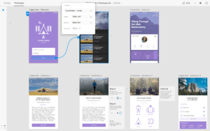
To give you another example of how your design can be improved, let’s take a look at a home-made flier for the Bolshoi Ballet. We’ve all seen fliers that look a little bit like this one.

There is a lot of text on the page, there is some terrible clipart which really doesn’t help and there are bits of text floating diagonally at the top of the bottom desperate trying to catch an eye. It’s hard to see at a glance information such as where it’s on, what it’s about and the small images are distractions rather than useful design elements.
To improve this design I first of all separated out the information into logical groups.
1. Name of event and artist
2. General info about the event
3. Where it’s on and how much?
Then I searched for an appropriate eye catching image to add to the design. No one design principle works alone and here I’ve applied the alignment principle so all the text runs the same width from left to right as the ballerina’s outstretched legs. There is a strong margin on each side of the flier. The dark blue in “Swan Lake” and the ticket information was sampled from the ballerina’s dress.

Ballerina Image Credit: Ballet.co.uk
This flier won’t set the design world alight, but it is an improvement on the original using proximity, alignment and contrast. It’s easy to find the information and it’s certainly a little more appealing to the eye.
To sum up, the main purpose of proximity is to organize information. You should allow plenty of white space around text and other elements so that you can really see the effect of grouping items together. Keep your eyes peeled when reading magazines, fliers and websites and look at how other designers use proximity and please feel free to share links to designs you like.
Frequently Asked Questions (FAQs) about the Proximity Principle in Design
What is the significance of the proximity principle in design?
The proximity principle is a fundamental concept in design that suggests elements placed close together are perceived as more related than elements placed further apart. This principle is crucial in design as it helps in organizing information, creating relationships between different elements, and guiding the viewer’s eye movement. It can significantly impact how information is perceived and interpreted, thereby influencing the effectiveness of the design.
How can I effectively apply the proximity principle in my designs?
Applying the proximity principle effectively requires careful consideration of the relationships between different elements in your design. Group related items together to create a sense of organization and hierarchy. Use white space strategically to distinguish between different groups of elements. Remember, proximity doesn’t necessarily mean items have to touch each other; it’s about creating a visual connection between related elements.
Can the proximity principle be used in digital design?
Absolutely. The proximity principle is not limited to physical designs; it’s equally applicable and important in digital design. Whether you’re designing a website, an app, or a digital ad, using the proximity principle can help you create a more intuitive and user-friendly interface.
What are some common mistakes to avoid when using the proximity principle?
One common mistake is overcrowding elements, which can lead to confusion and make the design look cluttered. Another mistake is not using enough white space to distinguish between different groups of elements. Also, using the proximity principle without considering other design principles like contrast, alignment, and repetition can lead to ineffective designs.
How does the proximity principle relate to other design principles?
The proximity principle is closely related to other design principles like contrast, alignment, and repetition. For instance, you can use contrast in conjunction with proximity to make certain elements stand out. Similarly, alignment can be used to further enhance the sense of organization created by proximity.
Can the proximity principle influence the viewer’s perception?
Yes, the proximity principle can significantly influence how the viewer perceives and interprets the design. By grouping related elements together, you can guide the viewer’s eye movement and help them understand the information more easily.
What is the role of white space in the proximity principle?
White space plays a crucial role in the proximity principle. It helps in distinguishing between different groups of elements and enhances the sense of organization. Without adequate white space, the design can look cluttered and confusing.
Can the proximity principle be used in text-heavy designs?
Yes, the proximity principle can be very useful in text-heavy designs. By grouping related text elements together, you can make the information more digestible and easier to understand.
How can I use the proximity principle to improve the user experience?
The proximity principle can be used to improve the user experience by making the design more intuitive. By grouping related elements together, you can guide the user’s eye movement and make the information easier to understand.
Can the proximity principle be used in logo design?
Yes, the proximity principle can be effectively used in logo design. By grouping related elements together, you can create a more cohesive and memorable logo.
 Jennifer Farley
Jennifer Farley is a designer, illustrator and design instructor based in Ireland. She writes about design and illustration on her blog at Laughing Lion Design.