 The internet — particularly its Web 2.0 version — is a very glossy place. In fact, I think if far-away aliens ever eavesdropped on our wireless internet transmissions, they’d conclude that humans must live in a hard world of polished marble, wet glass and high-gloss plastic.
While the gloss effect is probably getting a little ‘long in the tooth’, the main problem I have with it is the overall boring perfectness of the reflections. On the web, wet floors are always laser-cut mirrors, and glossy buttons always seem to exist in a perfect, evenly-lit vaccuum.
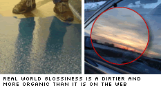 In the dirty, scratched and smudged real world, wet floors have dull spots and distortions in them and glossy surfaces warp, blur and reflect the patchy, organic world they inhabit.
Without wanting to wind the fashion clock back to the ‘distressed 90’s look’, you can give your reflections a bit more character without too much more work.
The Method
1). Let’s start with a rounded rectangle — it’s a button but it could just as easily be a nav bar, a banner or a content panel — and give it a vertical, linear red gradient. I’ve given it a subtle shdow too. This will be the edges of our button.

2). Next we will copy make a copy of that shape on top and and scale it down just a little. This will be the flat surface of our button.
![]()
3). Next we’ll take that upper shape back to a more basic white-to-black gradient and angle give it a slight angle. The anlge doesn’t matter, as long as it’s off the perpendicular.

4). Now if we switch the upper shape channel to ‘Screen’ (in the Layers panel) and position it centrally, we only get the light parts of the image showing, giving us the impression of a clean, highly-polished surface. I’ve moderated the gloss a little by lowering the opacity of the upper rectangle.
![]()
5). Alrighty, this is ok, but it’s exactly the kind of hyper-perfect gloss I talked about earlier. It needs a healthy dose of imperfection.
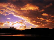 Go to your favorite stock imagery site and find an image with a strongly contrasting horizon (example:straymuse). The image contents don’t matter much otherwise, but we need a strong organic skyline. There is some trial and error in finding the right shot.
6). Bring the horizon image into Fireworks and take it’s opacity down to about 50%. Next position it centrally over your button and scale it down so the horizon is nicely framed by the button edges.
7). We’re getting close. Next we need to COPY the upper rectangle to the clipboard – BUT don’t paste it anywhere.
8). Select your horizon image again and go to ‘Edit/Paste as Mask‘. This will mask your horizon image down to the shape of our button surface.
![]()
9). We have a viable reflection now but the effect still looks a little too strong for me. We’ll tone it down a touch. First switch the channel of the horizon image to ‘Linear Dodge’ to keep only the light parts of the image which naturally reflect the most light.
Next we’ll add a slight Gaussian Blur — most reflections aren’t perfect mirrors, and a touch of blur will only remove the detail from the photo that we don’t need anyway.
And finally we’ll take the opacity down to around 30% — but this is really a personal preference decision. Keep in mind however you are probably going to have to place text on top, so legibility is a consideration.
Here’s the final graphic. The horizon image is barely recognizable but it still adds a really organic feel to the result. There are, of course, quite a few variables involved — layer opacity, channels and filter setting — and plenty of scope to tune the image to your liking.
![]()
I’ve kept this short and sweet, but if you’re looking to play around with the working PNG file, you can download a zipped version here.
 Alex Walker
Alex has been doing cruel and unusual things to CSS since 2001. He is the lead front-end design and dev for SitePoint and one-time SitePoint's Design and UX editor with over 150+ newsletter written. Co-author of The Principles of Beautiful Web Design. Now Alex is involved in the planning, development, production, and marketing of a huge range of printed and online products and references. He has designed over 60+ of SitePoint's book covers.