There is no doubt that flexbox is an effective solution for laying out web pages. However, past struggles with browser support have resulted in many developers having little knowledge of the flex layout and the sheer power that it holds. By referencing caniuse.com however, you can see that flexbox is now supported by pretty much all major browsers, thus making knowledge of the layout imperative to those who wish to stay current in web development.
Therefore, I have created this guide to help you become more familiar with flexbox by integrating the Compass CSS framework. I’ll use Compass to guide you through different flex-containers to show you how flexbox lays out child items, or flex-items, across different axes. Additionally, I will be to show you how easy it makes this process as it eliminates the need to include those pesky vendor prefixes that are still required for the deepest possible browser support.
Before we begin however, I’ll provide a brief overview of flexbox, so we fully understand the different mixins we will be using, and the effect they are having on our code.
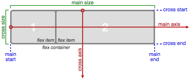
As you can see, flexbox consists of 2 axes — a main axis, and a cross axis. By default, flexbox will display items in rows that run from left to right along the main axis. On the other hand, the flex layout can display items in columns that stack on top of one another. For the sake of this article, I will only be dealing with the flex-containers, and how they can be manipulated. Throughout the tutorial, feel free to reference Compass’ documentation on flexbox, which provides information on the mixins I’ll be covering.
The display-flex() Mixin
First, let’s take a look at my initial example, which shows a basic flex-container with four flex-items. Flexbox is a new feature in CSS, so we need to import the compass/css3 library in order to utilize Compass’s flexbox mixins. Once I’ve imported the library, all I have to do is include the display-flex() mixin to define a flex container. As a result, I’ll now have a flex-container with items that run from left to right, and shrink as the viewport decreases.
See the Pen Flexbox with Compass: display-flex() by SitePoint (@SitePoint) on CodePen.
.flex-container  {
  @include display-flex();
  // flex is the default value
}
The flex-wrap() Mixin
If you narrow the viewport in the demo above, the flex-container will run out of space and a scrollbar will appear at the bottom. I can use a number of techniques in order to combat this. In the next example, I’m going to use the flex-wrap mixin to make the items in this flex-container wrap (i.e. drop to the next line) when the size of the viewport decreases.
See the Pen Flexbox with Compass: flex-wrap() by SitePoint (@SitePoint) on CodePen.
.flex-container  {
  @include display-flex();
  @include flex-wrap(wrap);
}
As you can see, the .flex-container rule set now includes Compass’s flex-wrap() mixin, which causes flex-items to stack on top of one another as they run out of space inside the viewport. Additionally, this mixin can take the values of nowrap and wrap-reverse. nowrap is the default value for flex-containers, and wrap-reverse will reverse the order in which the items are stacked.
By checking out the example below, you can see wrap-reverse in use:
See the Pen Flexbox with Compass: wrap-reverse by SitePoint (@SitePoint) on CodePen.
.flex-container  {
  @include display-flex();
  @include flex-wrap(wrap-reverse);
}
The flex-direction() Mixin
By default, flexbox will automatically render flex-containers as rows. Therefore, I did not have to define the flex-direction property in the first two. If instead we wanted to display flex-items stacked on top of one another, I simply need to pass in a value of column into Compass’s flex-direction() mixin.
See the Pen Flexbox with Compass: flex-direction() by SitePoint (@SitePoint) on CodePen.
.flex-container  {
  @include display-flex();
}

.flex-container:nth-of-type(2n) {
  @include display-flex();
  @include flex-direction(column);
}
The flex-flow() Mixin
The next example I’m going to discuss will demonstrate how to create flex-containers using the shorthand method. Moreover, I can combine the flex-direction and flex-wrap properties, and pass these values into the flex-flow mixin. Below, you can see this mixin being used to create a flexible row, which will run from right to left. As a result, the items will stack from the top down because a value of wrap-reverse is passed into the mixin.
See the Pen Flexbox with Compass: flex-flow() by SitePoint (@SitePoint) on CodePen.
.flex-container  {
  @include display-flex();
  @include flex-flow(row wrap-reverse);
  @include align-items(space-between);
}
Using flex-direction() to Manipulate the Main and Cross Axes
As I said earlier, the main and cross axes are so integral in understanding how flex-container works. To better delineate this, I am going to pass in values of row-reverse and column-reverse to the flex-direction() mixin.
See the Pen Flexbox with Compass: row-reverse/column-reverse by SitePoint (@SitePoint) on CodePen.
.flex-container  {
  @include display-flex();
  @include flex-direction(row-reverse);
  @include flex-wrap(wrap);
}

.flex-container:nth-of-type(2n) {
  @include display-flex();
  @include flex-direction(column-reverse);
}
With this, my flex-container displays items in reverse order. You’ve already seen that the main axis displays items from left to right; however, we have modified this behavior to create a flex-container that runs from right to left. Additionally, the flex-items in this row will wrap to the right side of the page. This is a result of our main axis beginning on the right side of the page.
Additionally, you see the same thing happen to the cross axis in the column layout. As you already know, the column value will lay out items from top to bottom, however the column-reverse value flips this axis, and gives us the result seen above. As you continue learning about flexbox, you will see that knowledge of how these axes work is extremely beneficial in order to have complete control over the items in a flex-container.
The justify-content() Mixin
In our next example, I’m going to check out Compass’s justify-content() mixin, which is used to align items along the main axis. The demo below shows another example of how we can modify the start and end points of axes in flexbox.
See the Pen Flexbox with Compass: justify-content() by SitePoint (@SitePoint) on CodePen.
.flex-container  {
  @include display-flex();
  @include flex-flow(row-reverse wrap);
  @include justify-content(flex-end);
}

.flex-container-2 {
  @include display-flex();
  @include flex-flow(row wrap);
  @include justify-content(flex-end);
}
By taking a look at the first flex-container, we see that I passed in the value of row-reverse to the flex-flow() mixin. As a result, it will run from left to right, thus effecting on the flex-end value. Moreover, it tells all of the items in this flex-container that the main axis ends on the left side of the page, which, as we know, does not follow the default flexbox layout.
In the second example, we see a typical flex-container, similar to the one in our first example. The value of flex-end has been passed into the justify-content() mixin for both flex-containers, however our second box shows how this flex-end value is supposed to work. As a result, all of the flex-items in this example are pushed as far to the right as possible. After all, the end of the main axis is the right-most side of the page, so this should make sense to us.
As we continue on, let’s take a quick look at some of the other values that can be passed into this mixin. In the previous demo, I have removed one of the flex-items to better show how these values differ from one another.
The first of the bunch will take a value of center, which, as you may have guessed, will center flex items along the main axis. Next, we see both the space-between, and space-around values being used to define our remaining flex-containers. In the second flex-container, we see that the space-between value pins the first flex-item to the beginning of the axis, and it will also pin the last flex-item to the end of this axis. Any of the remaining space will then be allocated in between the remaining flex-items. In this case, our second flex-item is the lone wolf, therefore it receives a lot of breathing room as it does not have to share this space with any other items.
The last flex-container makes use of the space-between value. When implemented, this value will evenly distribute any extra space in a flex-container between two adjacent flex-items. It is important to note that the first and last flex-items will only receive half of this space on the side closest to the container.
The align-items() Mixin
The last mixin we are going to look at is Compass’s align-items(). Whereas the align-content() mixin aligns flex-items along the main axis, the align-items mixin aligns flex-items with respect to the cross-axis. In turn, our flex items will shift upwards or downward, as opposed to right or left. We should note that this flex-container has a max-width of 1000 pixels, therefore we can see this in action as we we resize the viewport.
See the Pen Flexbox with Compass: align-items() by SitePoint (@SitePoint) on CodePen.
$flex-container-width: 1000px;

.flex-container  {
  max-width: $flex-container-width;
  @include display-flex();
  @include flex-flow(row nowrap);
  @include align-items(flex-start);
}

.flex-container-2  {
  max-width: $flex-container-width;
  @include display-flex();
  @include flex-flow(row nowrap);
  @include align-items(flex-end);
}
In the first example, we see two flex-containers. All of the items in the first container are aligned using the flex-start value. As a result of this, all of the flex-items are pulled to the beginning of this cross axis, which we know starts at the top of the container. Additionally, we can see that the flex-end value is having an adverse effect on our flex-container, and is pulling all of the flex-items to the bottom of the cross axis.
See the Pen Flexbox with Compass: align-items() (ver. 2) by SitePoint (@SitePoint) on CodePen.
$flex-container-width: 1000px;

.flex-container  {
  max-width: $flex-container-width;
  @include display-flex();
  @include flex-flow(row nowrap);
  @include align-items(center);
}

.flex-container-2  {
  max-width: $flex-container-width;
  @include display-flex();
  @include flex-flow(row nowrap);
  @include align-items(baseline);
}

.flex-container-3 {
  max-width: $flex-container-width;
  @include display-flex();
  @include flex-flow(row nowrap);
  @include align-items(stretch);
}
Above, we see the remaining values of center, baseline, and stretch passed into different flex-containers. We know that the align-items() mixin aligns items along the cross axis, so it should be easy to understand why we are seeing such results above. At the top of our example, all of the flex-items are centered on the cross axis, hence the name of the value. Next up, we see a flex-container laying out items according the baseline of each flex-item. Our mixin takes the stretch value, and thus stretches each flex-item so that no flex-item is bigger than another in this container.
Final Thoughts
And thus concludes my article on creating flex-containers with the Compass CSS framework. By now, I hope you have an understanding of many of the mixins Compass provides for defining flex layouts. I encourage you to make use of these examples above, and modify them as you please, as you it will definitely help you further your grasp on using flexbox.
Frequently Asked Questions on Using Flexbox with Compass
What is the basic concept of Flexbox and how does it work with Compass?
Flexbox, or Flexible Box Layout, is a CSS3 web layout model that allows responsive elements within a container to be automatically arranged depending upon screen size. The main idea behind the flex layout is to give the container the ability to alter its items’ width/height to best fill the available space. Compass, on the other hand, is an open-source CSS authoring framework which uses the Sass scripting language, helping designers write code more efficiently and quickly. When used together, Compass can help you generate the necessary CSS for a Flexbox layout, making it easier to create responsive designs.
How do I start using Flexbox with Compass?
To start using Flexbox with Compass, you first need to install Compass in your project. Once installed, you can import the Flexbox mixins provided by Compass in your Sass files. These mixins provide a convenient way to use Flexbox properties without having to write the raw CSS yourself. You can then use these mixins in your Sass code to create a Flexbox layout.
What are the main properties of Flexbox?
Flexbox has several properties that control the layout of elements. These include: display (defines a flex container), flex-direction (defines the direction of the flex items), flex-wrap (specifies whether the flex items should wrap or not), flex-flow (a shorthand property for flex-direction and flex-wrap), justify-content (aligns flex items along the horizontal line), align-items (aligns flex items along the vertical line), and align-content (aligns flex lines).
How can I align items in a Flexbox layout using Compass?
Compass provides mixins for all the Flexbox alignment properties. For example, to align items along the horizontal line, you can use the justify-content mixin provided by Compass. Similarly, to align items along the vertical line, you can use the align-items mixin.
Can I use Flexbox with Compass for complex layouts?
Yes, Flexbox combined with Compass can be used to create complex layouts. The flexibility of Flexbox allows you to create layouts that would be difficult or impossible with traditional CSS. With Compass, you can generate the necessary CSS for these layouts more efficiently.
What are the benefits of using Flexbox with Compass?
Using Flexbox with Compass has several benefits. First, it allows you to create responsive layouts that adapt to different screen sizes. Second, it simplifies the process of writing CSS, as Compass provides mixins for all the Flexbox properties. Third, it makes your CSS more maintainable, as you can use variables and functions provided by Sass.
Are there any limitations or drawbacks of using Flexbox with Compass?
While Flexbox and Compass are powerful tools, they do have some limitations. For example, older browsers may not fully support Flexbox, so you may need to provide fallbacks for these browsers. Also, while Compass simplifies the process of writing CSS, it does require you to learn Sass, which can be a learning curve for some people.
How can I handle browser compatibility issues when using Flexbox with Compass?
Compass provides a feature called “browser compatibility” which generates vendor-specific CSS for different browsers. This can help you handle compatibility issues when using Flexbox. However, for older browsers that do not support Flexbox, you may need to provide a fallback layout using traditional CSS.
Can I use Flexbox with Compass in a production environment?
Yes, you can use Flexbox with Compass in a production environment. However, you should thoroughly test your layout on different browsers and devices to ensure it works as expected. Also, make sure to optimize your CSS for production by minifying it and removing any unused styles.
Where can I find more resources to learn about Flexbox and Compass?
There are many online resources where you can learn about Flexbox and Compass. For Flexbox, a good starting point is the CSS-Tricks guide to Flexbox. For Compass, the official documentation is a great resource. Additionally, there are many tutorials and articles available online that cover both topics in depth.
 Thomas Greco
Thomas Greco is a web developer based out of New York City specializing in full-stack development with the M.E.A.N. stack technologies. Before web development, Thomas worked as a graphic designer, and he continues to utilize his background in design when building web applications. Have a question for Thomas ? You can reach him on Twitter.